![]()
![]()
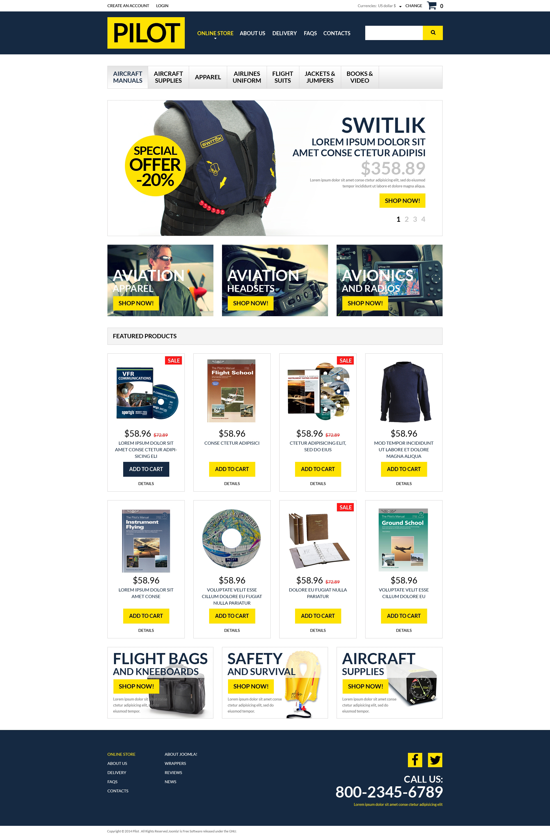
If you own a pilot store and want to widen your audience, here is a template for an easy start. Blue and yellow colors of its layout make a perfect contrast. A slider shows discounted products and draws buyers attention with round stickers. Banners are imagebased with calltoaction buttons over them. The fonts all over the layout are large and easy to read. 'New' and 'Sale' stickers give the customers additional information about the products. The navigation of the template is very simple. It helps to keep the page clean due to the dropdown option. The items in the content area are arranged in four columns and look great over the white background. The store looks reliable and serious. Is this the idea you'd like to convey to your customers? Then, come on and take action.

