![]()
![]()
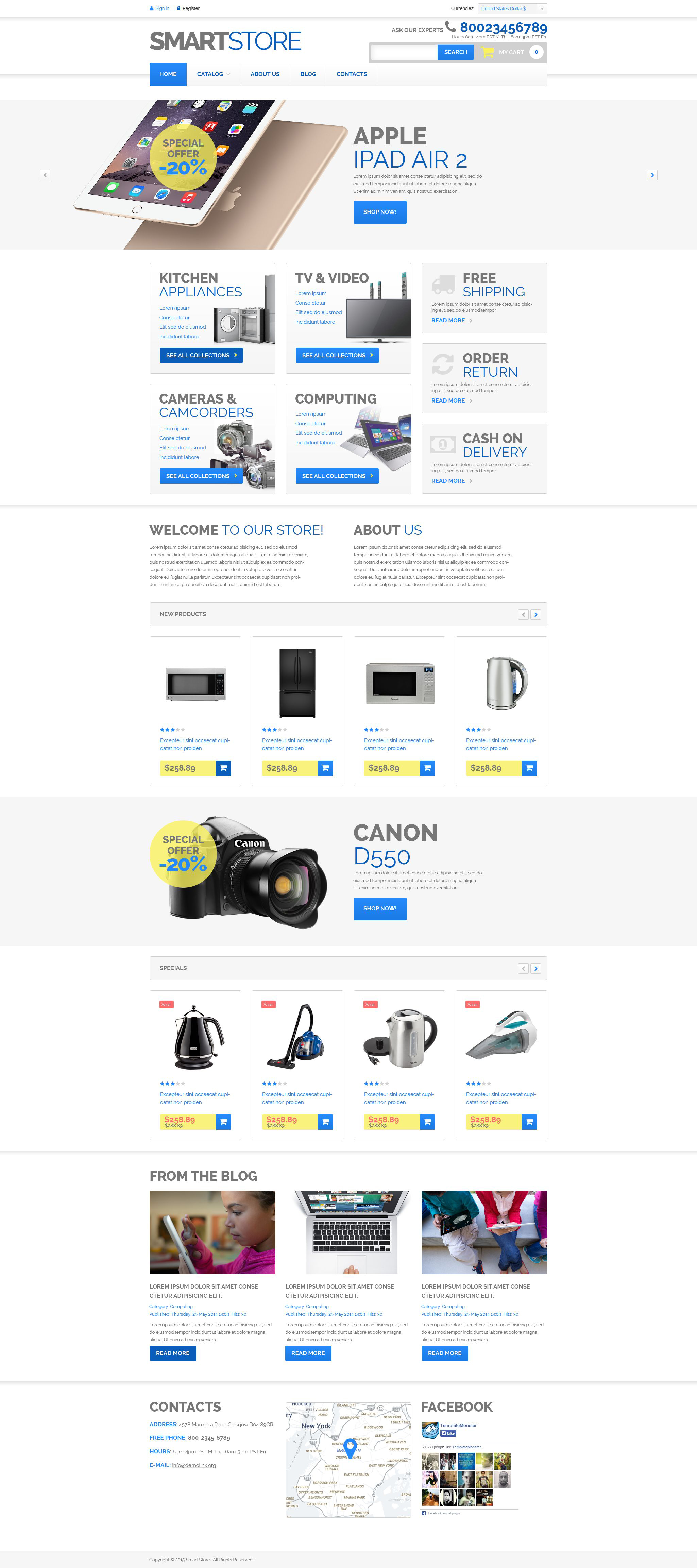
If you like minimalism in design, this theme is a great option. Lots of white space gives visitors air to breathe and lets them understand that the products are more important than the environments. There are three sliders on the page. They allow showcasing as many products as you need and keep the design uncluttered. Multiple banners boost website's navigation and provide additional information that may be interesting to the users. The visitors will be able to read about store and posts from the blog as well. Contacts, Google map and social media block are surely available at the bottom of the page.

