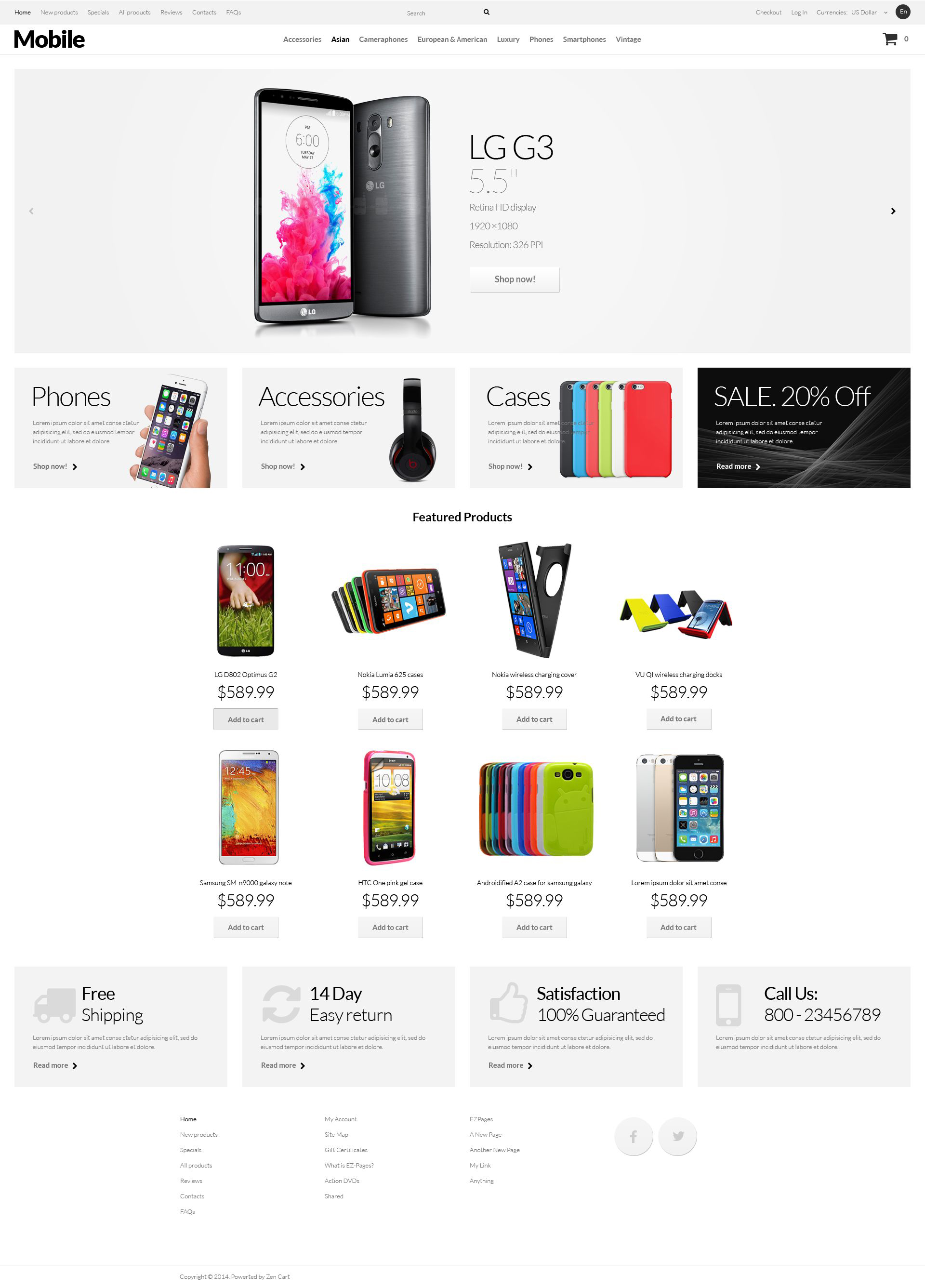
Mobile Phones ZenCart Template

Everybody likes minimalist designs. It is especially good for various stores. There is lots of white space and no tinsel in the layout. This helps the visitor concentrate on the products you offer. Here they are excellently noticeable against the white background. Slider, banner and new item photos look very tempting for the customers. The bottom set of banners is rather insipid, which shows the user that they contain supplementary information. Additional menu and large round social media buttons can be found in the footer, as usually.
tallosweb MarketPlace
tallosweb is a marketplace where you as a designer or developer may sell your Web Design Software, Website Templates, Design Elements, Plugins and Extensions. Become a digital products vendor and earn up to 70% from each sale.